more up to date version of site here.
Hello! Isn't this quite the blog layout!. It's fucking twitter. I love that god damn site layout, so I asked their own fucking Ai to rip it BAR FOR BAR, at least the essentials. How do you think? You can also look at the html to take it if you want.
Down below are two test posts that I tinkered with dealing with the lightbox feature. The one with Alt text will have it displayed on the right of it, the one without works as a lightbox should. It's crazy. I can start porting my gameplay threads on this site if I wanted too!
My thought here is that Twitter's layout... is really fucking good deny it as you will. So what if you can take the base form of it, then customize it to your own? This site right now is the bare bones replica of that site. The other pages could if I dare wanted to have random other features you wouldn't associate twitter for. Take that calandar I threw up there for example.
There were some troubleshooting I had to do with the images, the alt tag feature, youtube embeds (too hard?) The media queries for responsiveness... There was also a situation with mobile wdfhere only when there is a long uninterrupted piece of text in a post, the layout breaks... kinda shit huh. Also had to solve the mobile layout by adding a little hamburger menu which pops in and out the left column. That shit also had issues of remembering where you were on the page. That took a while to figure out. I say figure out like my brain did it but it was all AI not gonna lie. But hey now this shit ready for me to one day just make diary posts and long formed reviews.
Anyway below you can test a bit of the features. I should probably add a go to top feature somewhere... Though desktop only cuz mobile kinda has that built in to the browser, guess the home key works too?
This is a sample blog post with an image and alt text.

This post has an image of paimon but no alt text.

This post has no profile image or headers so act as a continuation to the last post... Kinda unneccessary however since I'm not contrained to a 300 character word limit.
FUCK THE MOBILE LAYOUTTTTTTT
I DONT UNDERSTAND WHY IT DOESN'T AUTO ADJUSTTTTTTTTTTT
After troubleshooting I learned that you cannot have very long unbroken string of characters in these posts or else it just fucks with the mobile layout
FUCKING TOOK ME A GOD DAMN WHILE
BUT I FINALLY IMPLEMENTED THE DAMN THREADS CSS JS INTO THIS BITCH. STILL LOOKS ODD BUT IT DO WORK
youtube embed test, the width must be adjusted to 500 or less. it works if I used the same css for images for iframes for the embed. genius hah
After perhaps throwing in 15 hours or so into this I believe the base version of this site layout is complete. I want to basically tell you about the odd quirks and features I added to here...
1. Hamburger menu: Not exactly a drawer style menu, it's main purpose is to hide the left navigation column. which is a sore for mobile experience. It also tries to remember where you were scrollwise. More apparent to see on mobile. That required some JS magic curious.
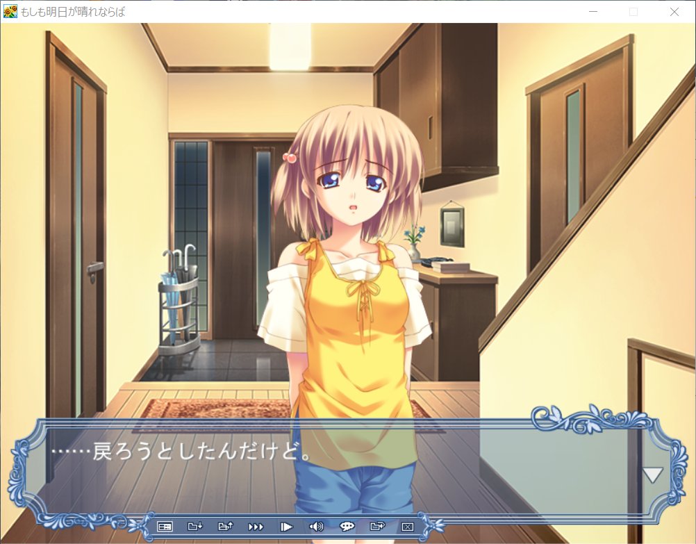
2. Lightbox with alt tags viewable in a text box. This feature is one I made for my specific use. I use alt tags to basically put translations in for VN scenes. This is one way to translate that over to here.
3. Thread interaction. This one took some time to implement. Basically connecting two or more posts with just class indicators. This took some JS to do and logic but for the most part works perfectly.
4. I couldn't exactly get the right column to work like twitter's no matter how much I toiled so a sticky scrollable right column does the job. There is a bit of JS to make it scroll to the top if you happen to scroll the main body to the top as well. Right column is only viewable on desktop or a wide ass tablet I guess. so cant be too assed...
5. Things such as youtube embeds, videos and audio tags theoretically should be responsive and be contained in the main content area.
And there you have it! It's a pretty decent twitter dupe. But since it's static you can change a bunch of stuff to your liking page by page. I imagine theming a page with colors or having random effects around. It's a damn solid foundation.

